Personal Branding
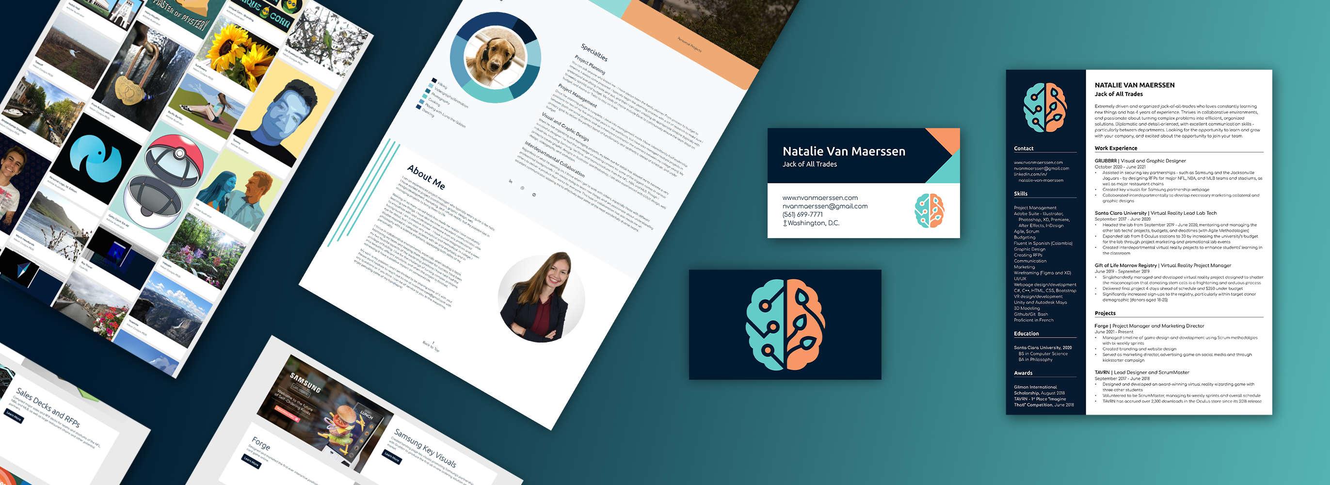
For my personal brand identity, I wanted to
emphasize my versatility. I am both highly creative and extremely
analytical, but I thrive in the intersection of the two. My personal
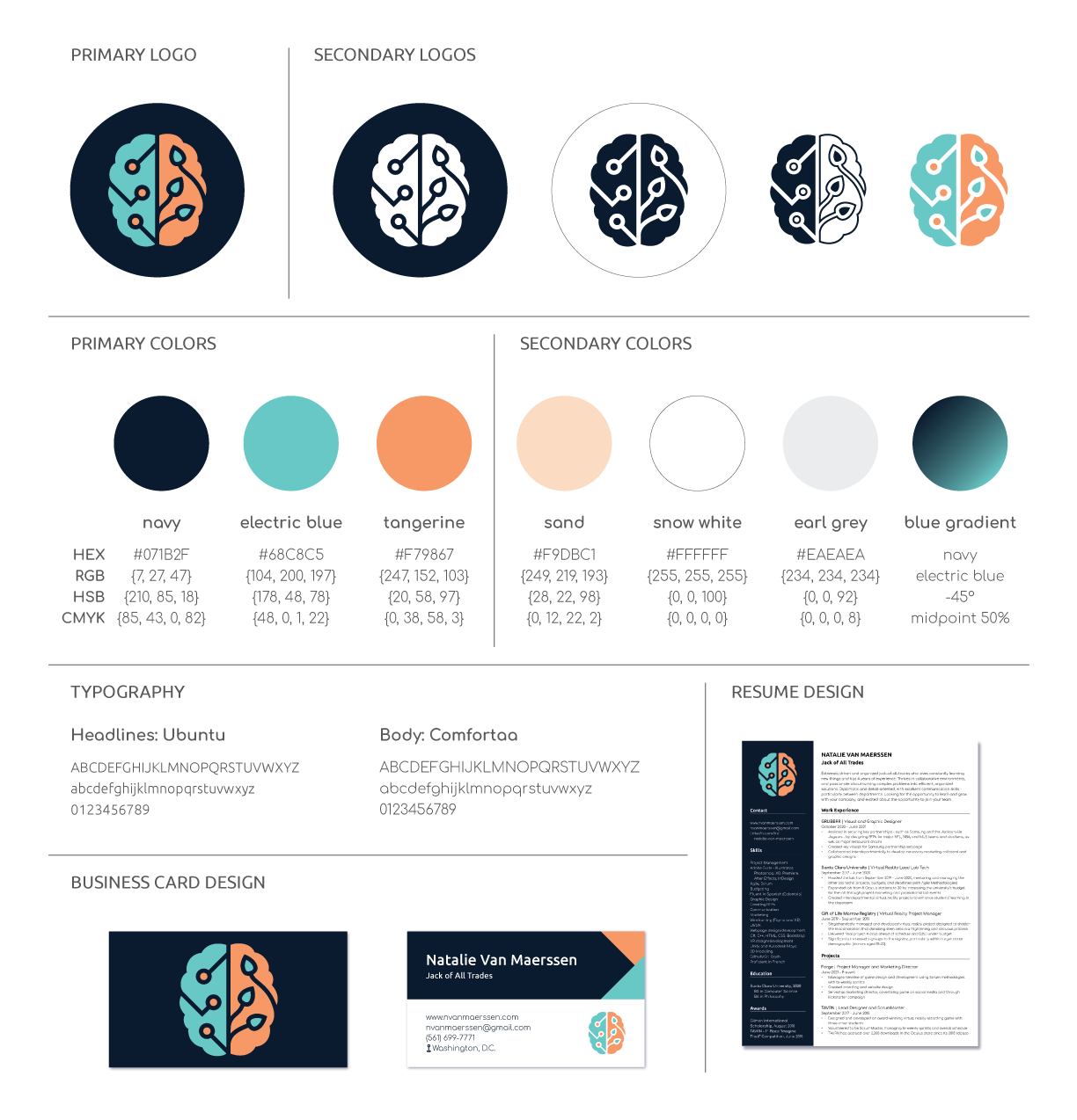
logo was born from this idea. For example, blue is and erudite color,
often associated with knowledge and learning, while orange is a much
more creative color. Both sides work together though, which is why
the blue side of the brain has spots of orange, and the orange side
has spots of blue. This theme of duality continues to present itself
in the typography used. I chose Ubuntu as my header font because it is
bold and impactful. Comfortaa on the other hand is very round and
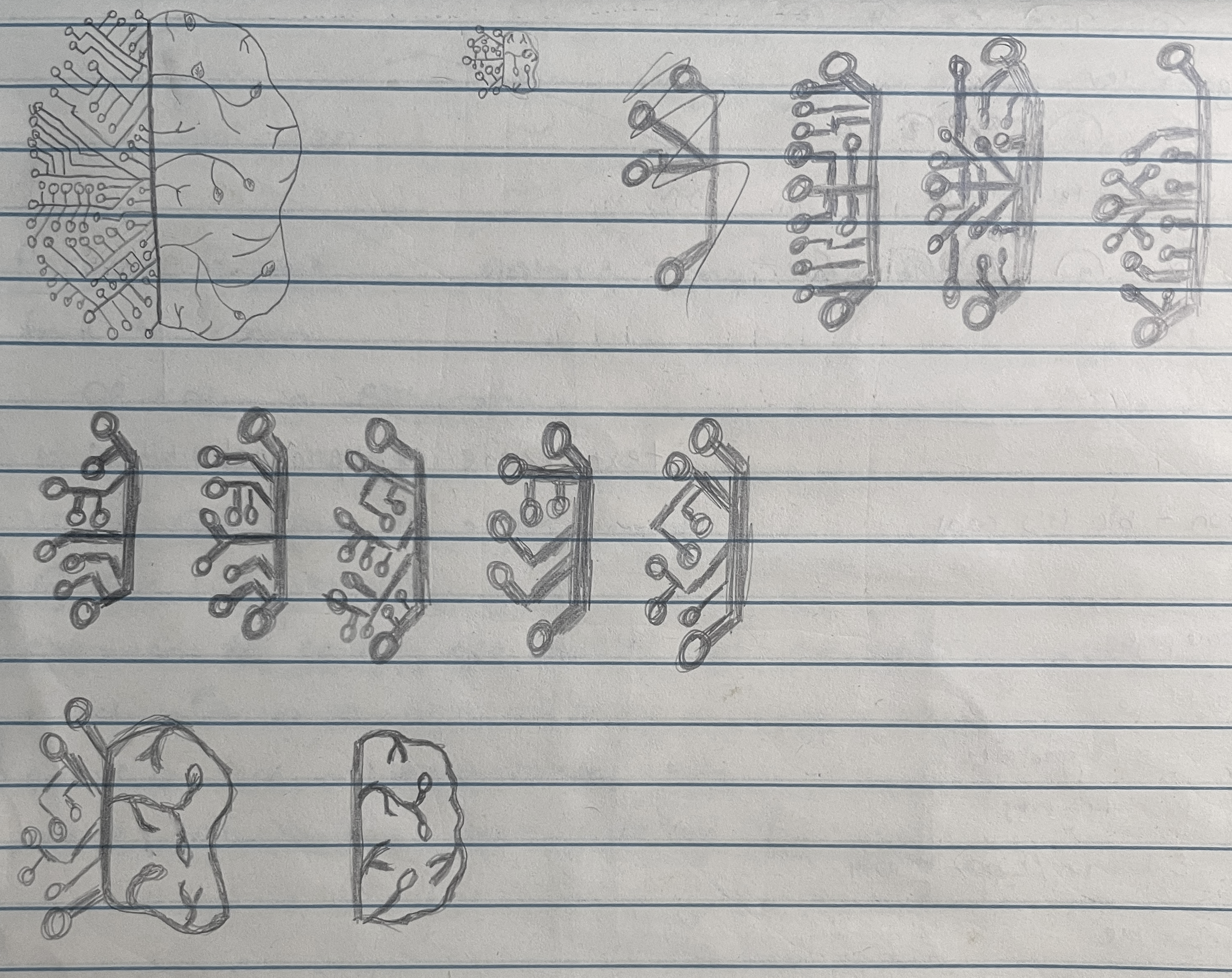
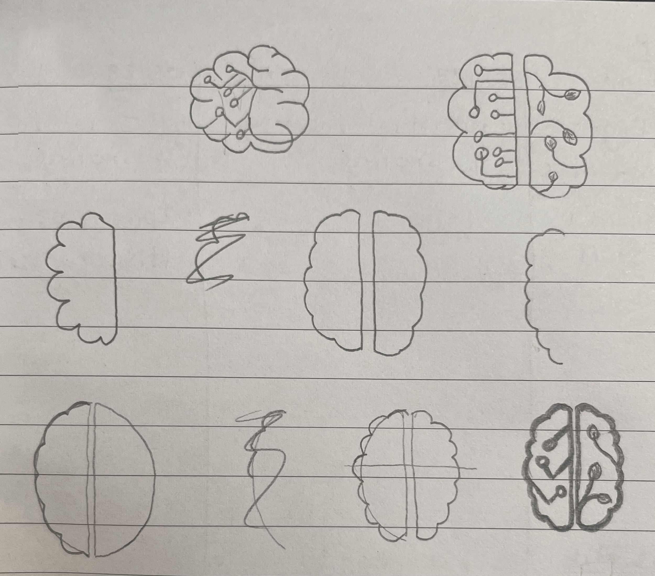
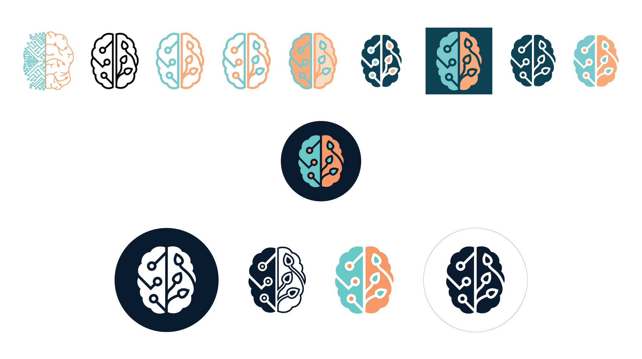
bubbly, which felt suitable for my main body text. Below are some
pictures of my process, specifically in the creation of my logo and
finally my style guide.
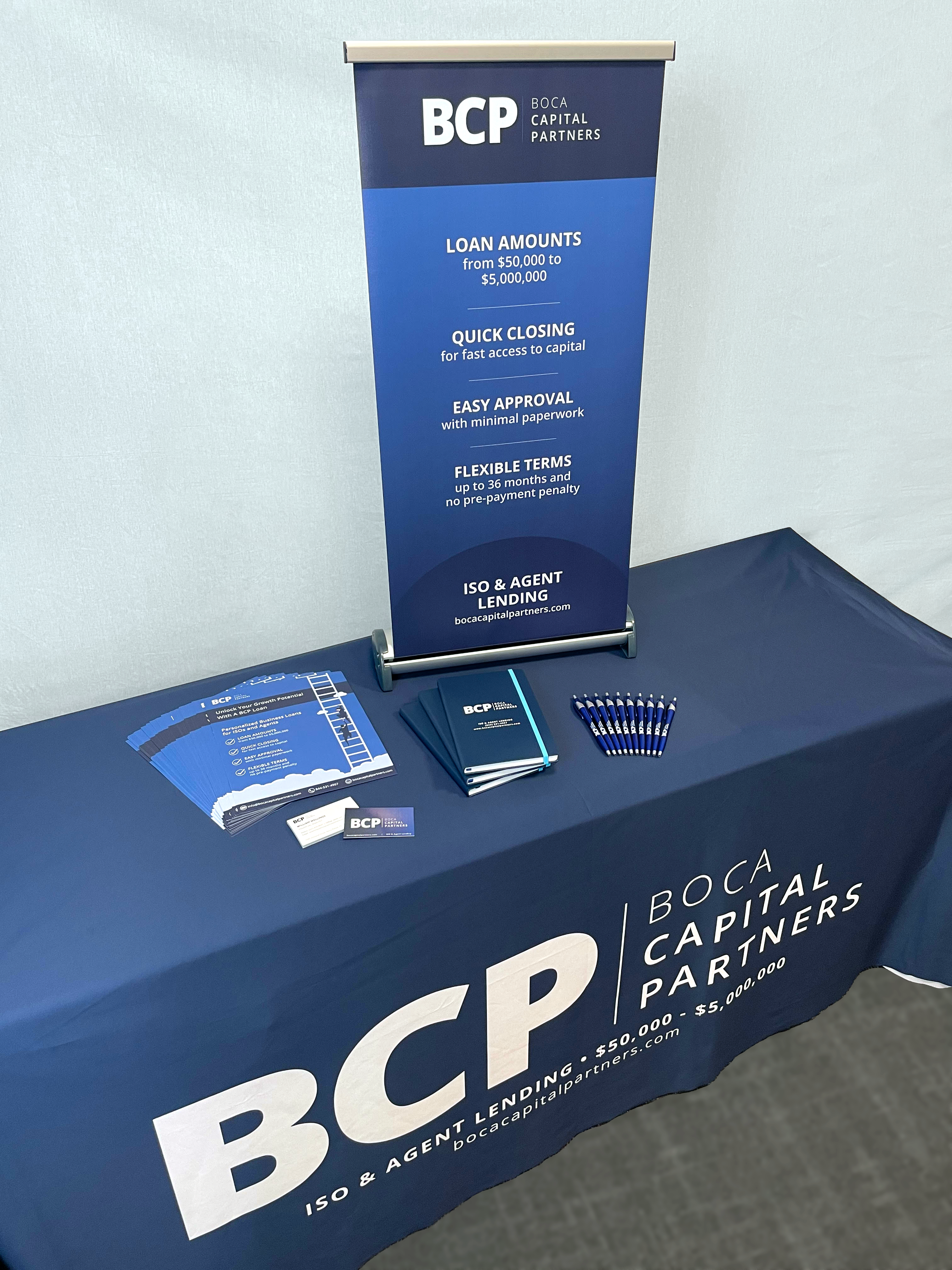
Boca Capital Partners Re-Branding
While working in the marketing department at
Grubbrr, I often found myself working on projects for TouchSuite and
Boca Capital Partners - two other companies housed under our roof -
as well. One of my biggest projects was re-branding Boca Capital
Partners for the 2021 tradeshow season. Navy blue was chosen as the
primary color since it is often associated with trust and reliability,
and Avenir Next was chosen as the company's main font for its clean,
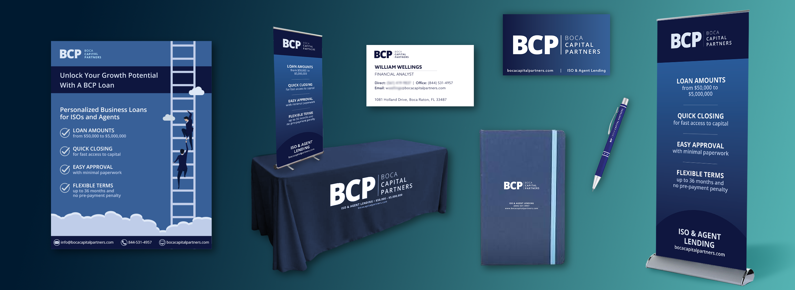
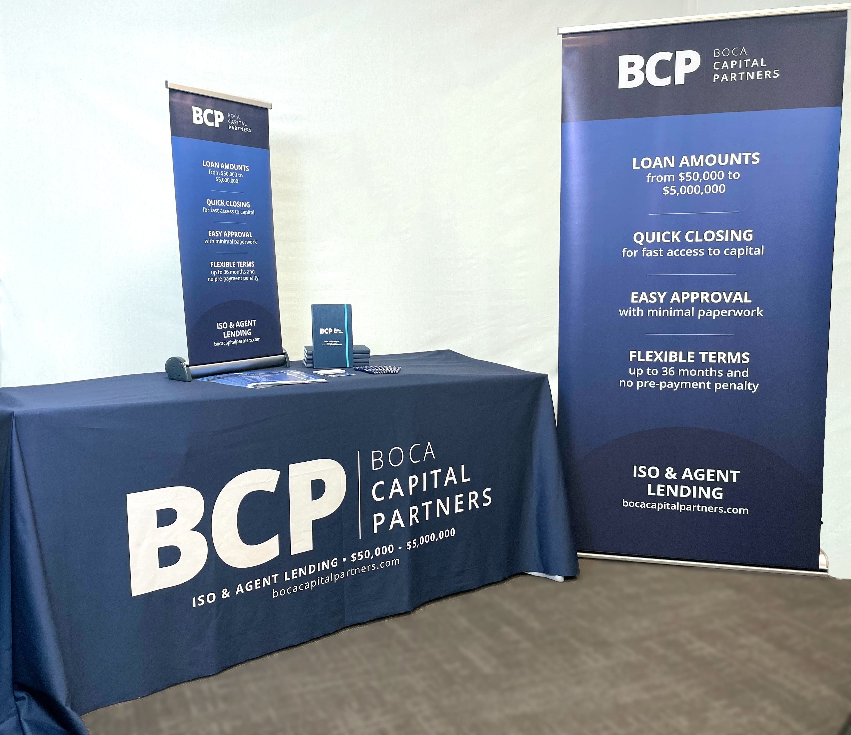
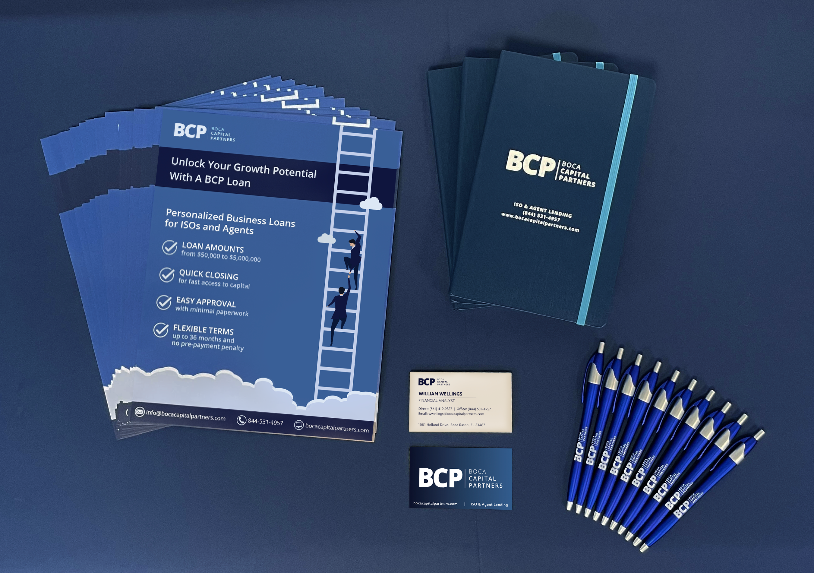
classic structure. Below are pictures of some of the products I designed
and ordered for the tradeshows with these new brand standards.
